Sorry, no Chinese history content here. I stumbled across a couple of cool blog tools and thought I would try them out. One of them is Touch Graph

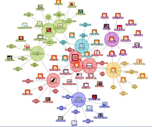
The applet generates the image above, which shows where this blog fits in the general blogosphere.1 Apparently we are somewhere between the China blogs and the history blogs, which sounds about right.

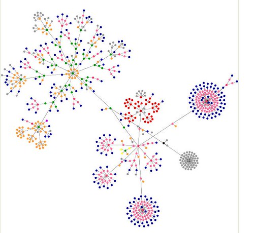
This image is generated by http://www.forreststevens.com/htmlgraph/ and shows the link structure of the blog. If I were more tech-savvy I could probably learn something from this, but as it is it is a pretty picture and it is cool to watch it generate itself.
It’s not just who links to who, but is based on mutual references ↩
1 Comment