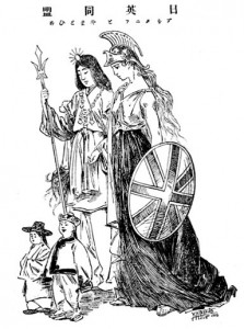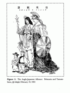
Above is a nice image that I use in class. I think I got it from Fairbank. I am not quite sure where it comes from, but it is clearly dealing with the Anglo-Japanese Alliance. A version I found through Google Image suggests that it was published in 1902.
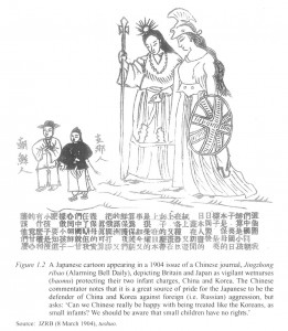
The reason I bring this up is that I just found1 another version, published in China in 1904
This is clearly a re-drawn version, either from the Japanese original or from some intermediary version. The Chinese version has a caption, which laments the Chinese being compared to the child-like Koreans, but as I don’t have a Japanese caption I can’t really compare that. It is the picture I find interesting. I get the impression that the purpose of the Japanese original is to make Japan and Britain look equal. and China and Korea were just minor elements. The Chinese version changes a number of things, and while this may just be a hurried artist at work I find the changes interesting. Japan and Britain are the center of the Japanese version, but the Chinese version has a more balanced composition. Height changes a bit between the two versions. In both Japan and Britain are the same height. (Britain looks taller, but that is just because she is cheating with that helmet technology. At a spiritual level they are equal.) In the Japanese version China is taller than Korea, but in the Chinese version the Koreans are taller, perhaps to emphasize China’s humiliation. The Chinese figure in the Japanese version is more active (I think) than his Korean counterpart, but in the Chinese version they are both static and being observed by those above. Most interestingly, the Chinese figure has been completely re-drawn. The Japanese version has him in something that looks vaguely like an official’s hat, identifying him with the dynasty. The Chinese version has a more generic hat, identifying him with the race. The Chinese version has a very obvious queue, perhaps identifying him with subservience to the Manchus. The Japanese version seems to assume a public capable of identifying national stereotypes without a caption, but the Chinese version adds them. I don’t know what to make of the fact that the Chinese version seems impelled to turn this into a landscape by adding a ground, or the fact that it both images we have two male figures subordinate to two female figures, but nevertheless they are interesting images.
from Paul Bailey, Gender and Education in China: Gender Discourses and Women’s Schooling in the Early Twentieth Century.London: Routledge, 2012. ↩

