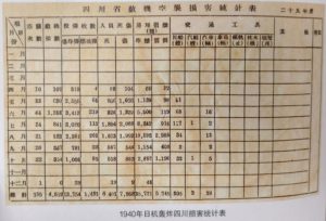
One thing that you notice when you look at Chinese government reports and such from the 20’s 30’s and 40’s is how amazing the graphics are. I have no idea why this is, but even in unpublished reports they do amazing full color graphics. even during the war, when print standards really went down, the were still doing it. I have seen lots of examples of this, but since I just saw some in 四川省檔案管. 川人抗戰:檔案文獻圖集.四川人民, 2015 I thought I would pass them on. So here are statistics on Japanese bombing of Sichuan in 1940. Information is conveyed, but it is so dull
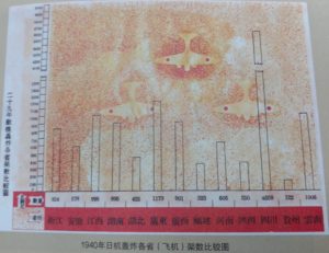
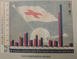
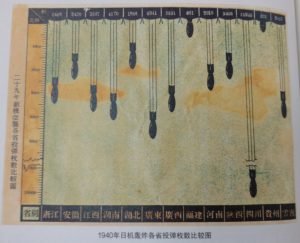
Far better are these, on the comparative number of bombers, casualties, and bombs dropped by province.
These are not any better in terms of information, and arguably worse, but they are much more striking. I have no real point to make about these, but I did want to put up an example.


